
By Elise Rezendes
Note from the editor: This article is Part 2 of “The Box is Now A Billboard” For the first time, GPI’s newsletter has a guest writer. I had been wanting to write an  article about the beauty of game box art and then had the good fortune to meet Elise when she chose GPI as her manufacturer for their Kickstarter, The Session Zero System. The art for her game was just stunning and how she spoke about working with the artist was inspiring. So in short, I recognized a gift as it landed in my lap and recruited Elise to tackle this topic. Â
This is the second in a two-part article series exploring what it takes to design great box art in the continually shifting landscape of tabletop games. In the previous piece, we looked at centuries past and the history of board game boxes. Now it’s time to look at what the Cover Art of today’s games can tell us about where we may be heading!
We touched previously a bit on how boxes can act as billboards in game stores and online; all vying for a potential player’s attention amongst a sea of options. So much goes into the design elements of a board game but when it comes to outward-facing works there are a lot of marks that must be hit in order to catch interest, act as a preview of what can be found within, and set the tone for the game inside.Â
While the goals may be the same, it is incredible to see the different paths a design team will take to hit their intended targets. Within games driven by the journey a player takes while playing; there are a few examples that come to mind that strike me as exemplary.Â
Game and Curry Games, Wet Ink Games, with designer Banana Chan brought us “Jiangshi: Blood in the Banquet Hall.â€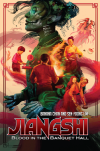
This collaborative storytelling RPGÂ is about a Chinese family making their living by running a restaurant in one of America’s Chinatowns (circa 1920) by day and facing their local hauntings by night. With that blurb alone alongside the incredible box art by Kwanchai Moriya, a picture starts to form of the story wanting to be told.
By picking out prominent elements in the piece we can begin to meander our way down the path the designers are offering us. Elements of communal cooking and scenes of food preparation and family weave themselves along a twisting dragon’s back providing the thread holding this game together. In stark contrast in color and composition sits the skeletal central figure. Interrupting the daily routines of the other depicted figures, in size as well as presence, lets us know such ghostly happenings will not be able to be ignored within the game. The pallet and movement captured in the piece speak to the pace of the game, the themes of family and community, and the overarching threat of horror lurking at the edges. In these ways, we see not only what but how the design team wants us to look at their game!
Similarly, but perhaps from a different direction, we see the way Spencer Starke and Hunter’s Entertainment present “Alice Is Missing†with their box art by Julianne Grepp. 
This is a silent game about the disappearance of Alice Briarwood, a high school junior in the small town of Silent Falls, and focuses on immersing players in a tense, dramatic mystery that unfolds organically through the text messages they send to one another.
From the artwork alone we get a sense of longing, of a person out of place or perhaps lacking belonging in the town they look over from a distance. The color pallet selected is a hyper-saturated sunset as if alluding to endings, losses, and mysteries unsolved away from the daylight.
With more distance as a silent RPG captured in the overall tone of the box art this game does an incredible job of giving players a first taste of what is to come should they pick up a copy for themselves.Â
With our eye on all of these ways in which designers communicate their intentions through cover art, Gabe Hicks and I got to work designing our own piece for The Session Zero System alongside our Illustrator, Dakota Curry.Â
First, we had to collect the elements of the game we wanted to highlight and work to incorporate them into this piece. Our game helps TTRPG players with any system create rich and deeply interconnected backstories for their characters. With that in mind, we started collecting our themes: new adventure, the power of choice, merging paths, twists of fate, wonder, and the magic of the unknown. We also knew we didn’t want to give away so much that the piece felt like another work in the book, we wanted it to strike its own harmony and bring a sense of excitement and possibility to potential players.Â
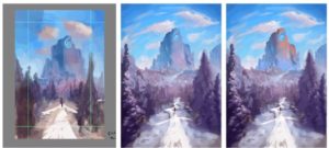
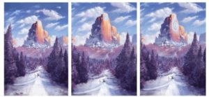
Cover artwork progression for ‘The Session Zero System’ by Dakota Curry
We asked Dakota what aspects of designing a cover piece he found most important as the artist.
Dakota: “ I think, for me at least, priority number one as far as designing the cover itself goes, is impact. Thinking, of course, beyond all the requirements of “this is a good art piece†because those priorities exist for everything, the impact for me is critical just because this is your introduction. Any cover piece is the first impression, right? So really nailing that composition and making sure that whatever you’re working with is going to bridge that initial first impression and draw audiences in to look at the product is really the cornerstone of my process regarding planning these covers.â€Â
We also wanted to know if there was anything that stood out to him working on this cover piece that best encapsulates his experience of all of your other pieces inside the game.
“I found myself particularly noticing this impulse to try and make the cover more and more referential in some way, which was something I wanted to avoid if I could. Throughout this whole project, I’ve tried to avoid imposing narratives with any specificity or requirement. If the whole point is something that you can use to tell any story, then intrinsically to confine that to any predisposed rails is doing it a disservice. I ended up instead trying to encapsulate the feeling of the product rather than the content and strove to create something that invited exploration and inspiration rather than dictating or mandating any given choice. “
Wherever you land in the industry, from player to creator, there are secrets hidden in every choice given space on a piece of Box art. It’s a game in and of itself to divine what wants and intentions those details reveal about the journey a designer has offered to take us on.Â
I for one am looking forward to all the different mysteries there will be to unravel in the future!

Recent Comments