“So, Ryan,†you may begin…
“Question: How do you approach color when designing a game package for a client? Where do you start…where do you end? How will I know what the consumer responds best to? Is there a science to it?â€Â
Ahh, and what a great question that is, my friend…
It’s Not Personal
First off, remind your client that the color isn’t personal. It’s much more important that the color best represent the product and distinguish itself from the competition than subjectively appeal to the VP of Sales. Marketing feedback is extremely important (even the best looking package won’t sell itself) and when designers lose sight of this they’re weakening their position as The Expert AND the future of the product itself. On the other hand, you’d be amazed how many times I’ve heard (for example), “I don’t like green†or something to that effect without any support other than subjective or anecdotal feedback. NO ONE responds positively to every color on the wheel (I wouldn’t be caught dead wearing teal), but individual tastes aren’t important here. Present your best case as to why you’ve explored each option and what the color will say to the consumer. Every color has a mood and a voice (information that’s easy to find with a quick Google search) so include this in your presentation if you haven’t already outlined it in the brief.
It’s all Black and White
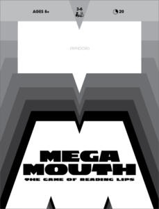
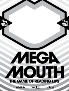
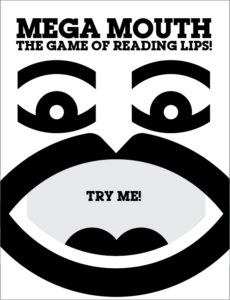
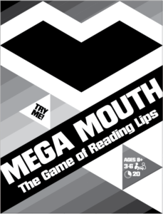
Personally, I begin the graphics process in black and white. Aside from designing packaging, and posters, my main love is creating logos, in particular modernist logos that rely heavily on abstraction, simplicity, and legibility from miles away (think the classics from the masters, like Malcolm Grear’s Center For Disease Control logo, Paula Scher’s CNN trademark, and to keep it in the toy and game industry, Paul Rand’s Colorforms’ icon – all still in use today!). Way back in art school, we learned that if a logo doesn’t work in black and white, it doesn’t work at all, and I’ve carried that ethos into my package layout process. Because I tend to favor geometric forms, flowing shapes, bold type, and linework and stripes, black and white explorations (with grayscales substituted for any colors that will abut one other) work well for me. I compare this to the way character and scenery illustrators use blue like sketches to flesh out their compositions way before color is even considered. The thinking behind this is that any design clear enough to work in B&W will be as eye-catching from far away (think walking down a retail aisle) as it is up close (an Amazon listing) once the color is added.
It goes without saying that the color is a crucial element that brings each idea to life, but the black and white “skeleton†of each design is the foundation for the color that comes later.
Color It In
It’s after all my forms and shapes and type have been rendered and arranged that I add color. I rarely show the b&w stage to my clients (you won’t need to prove to them that the composition’s strength is based on your seasoned design skills; they’ll understand that intuitively as they respond to the work). As they are (understandably) as interested, if not more interested in the colors of the package than the composition itself, and how their game will stand out next to competing product, there’s no sense in making them wait to see color options (“What colors are you thinking†will be the first thing out of their mouths).
It’s here that I’ll offer a confession: I am not a natural when it comes to new and exciting color combinations. I have always been drawn to the bold and basic: red, yellow, and blue (think the original Lego brick sets), yellow, black, and red (70’s era exploitation movie posters), red and white…OK, ANYTHING with red and a lot of it (just check out the GPI branding). Sports uniforms have always been central to my aesthetic influences, generally designed to be bold and immediately recognizable on small, lo-def TV screens of old before UHD screens made even the smallest details noticeable. Team colors (though it’s evolved A LOT over the years) were simple and familiar combinations. So it’s likely that the color lobe of my reptile brain was influenced (and still is) by that specific corner of the design world. It simply does it for me.
Find Your Inspiration
I also freely admit that my favorite color combos (and the liberal use of red in particular) do not work for every game (if many at all), every theme, or every mood I’m looking to capture. So when dealing with an abstract idea that isn’t constrained by needing to look like an actual object (see Big G’s “Mega Mouth†package concepts below) I always have a tool kit handy, and there has never, ever been a time in the history of design and branding that makes it as painlessly easy (and free) to find inspiration than right here in the 21st century. Instagram, Pinterest, Dribbble, Behance, Deviant Art, and scores of other creative platforms are bursting with millions of bits of inspiration and ideas, so pick your poison and drink it all down. You might find color inspiration from an illustrator you follow, a sneaker feed, a vintage poster collection, an interior design site, a book cover, etc. It’s endless, and it amazes me the “new†combinations that creatives come up with that will give exciting variations to a designer’s options when we present them to our clients.
Now having said all that, the best / most appropriate color choices might be driven by the theme itself, particularly if that theme is based in the real world. If the cover design features water, then it’s probably going to read best as a shade of blue. If the game features an animal, then it certainly makes the most sense to color the creature to match its real-life counterpart. The same applies for food, plants, people, or an entertainment license, etc. Look to the real world to guide your color choices. It’s fun and completely acceptable to mix things up for the sake of originality and imagination, but when you consider that your package will get a split second of attention from a busy shopper, it’s often wisest that the colors of the objects themselves are immediately recognizable. Your overall branding will fall in line to best compliment the color of the hero art.
And Be Yourself
Lastly, do you. There have been quite a few conversations during the brief stage when I’ve heard, “We really like what you did with such-and-such product,†and a lot of times they’re referring directly to the color combos used. Assuming you’re not working on a new product that competes directly with a past project, then hey…give the people what they want. Maybe you have a signature color look that clients will begin to seek out. Now you’re on to something.

